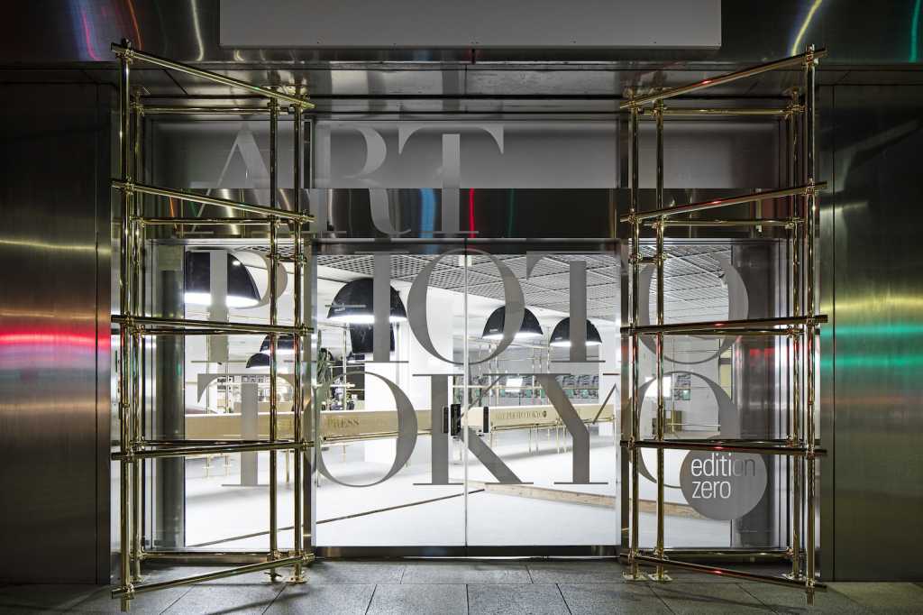
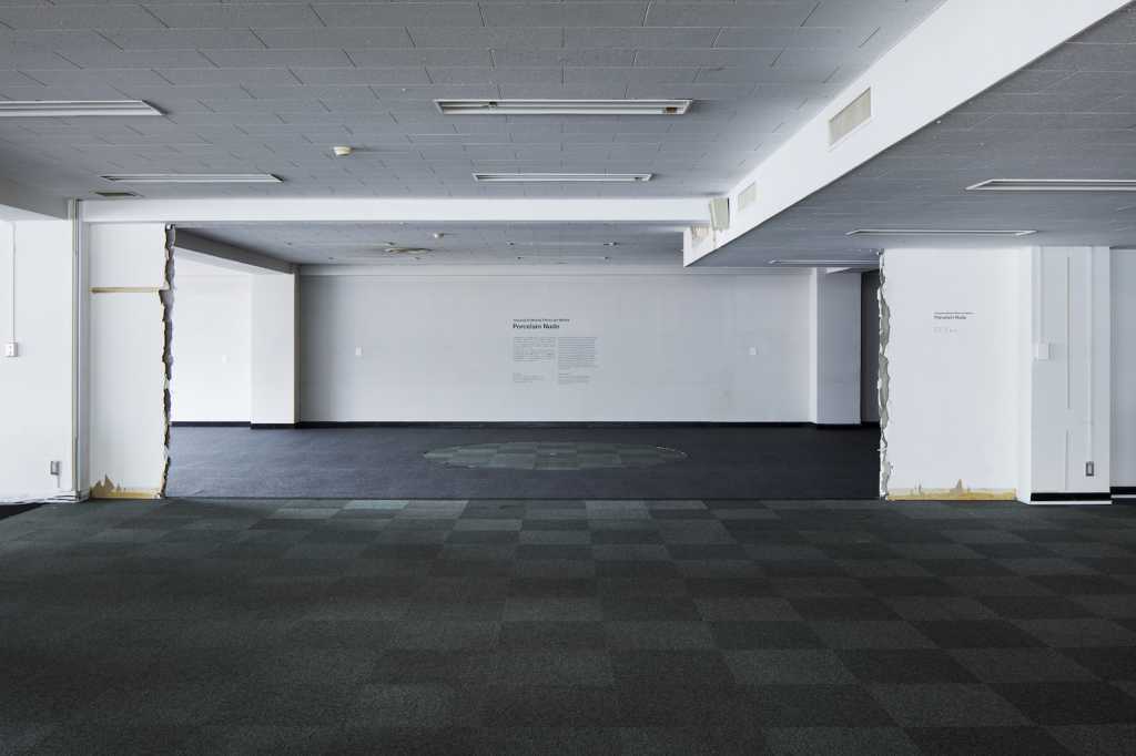
「アートフォト東京」の会場となった茅場町にある空きオフィスビルは、ところどころ古き良き昭和の丁寧なディティールがあるが、良くも悪くも「廃ビル」といった感じ。このビルの1~3階、8~9階を使い、30以上ある各階の部屋のレイアウトはそのままに、ギャラリーやフォトグラファーの作品を展示するため、各展示室をつなぐ動線計画と共用部分をデザインした。
同イベントは、アートとしての写真だけでなく、ファッションやコマーシャルの世界で活躍するフォトグラファーの作品を並列にパッケージした見本市で、さらにイベント自体を東京発信のコンテンツとしてプレゼンテーションする必要があった。そこで、廃ビルのコンテクストや様々な作家の個性や多様性を受け入れられる、ニュートラルだがラグジュアリーブランドと赤ちょうちんが同居しているような、アクの強いプラットフォームを目指そうと考えた。
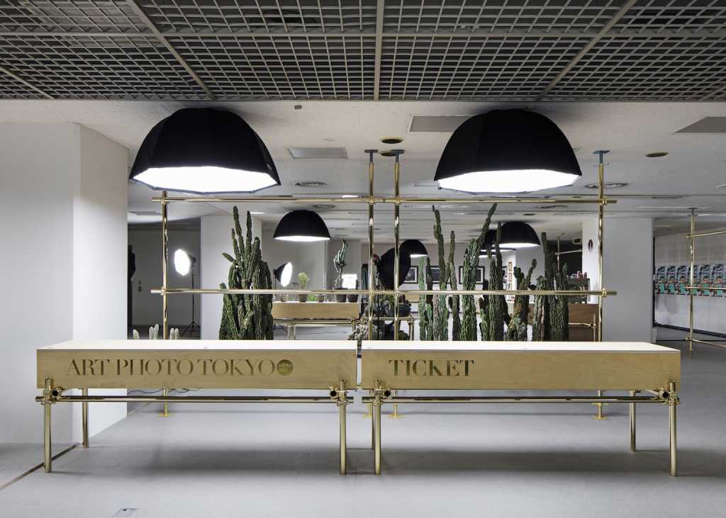
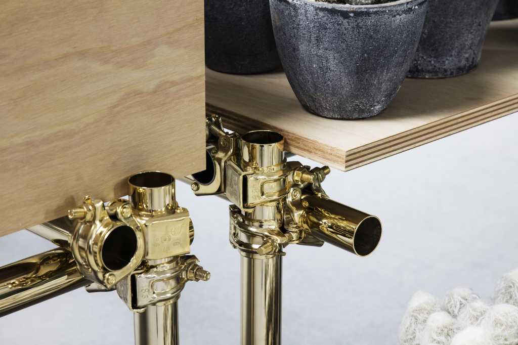
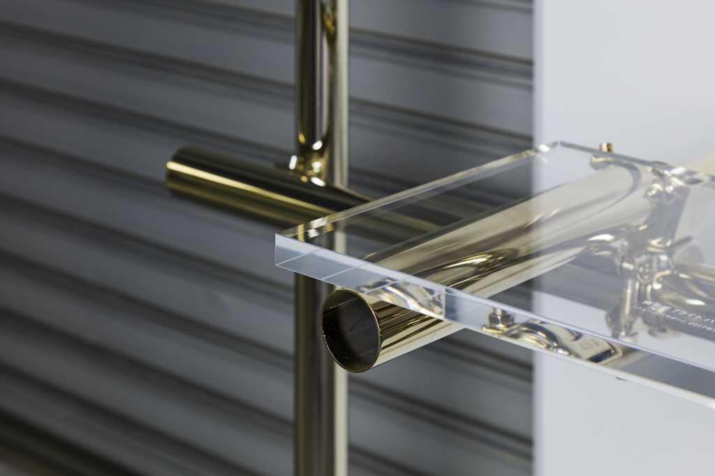
また、同イベントは4日間だけのため、設営に手間がかからない工事現場で足場を作る単管パイプを採用。組立が簡単で、何より安い。ラフな仕上げのままでもカッコいいが、ピカピカの金メッキに仕上げた。ローファイな材料とゴールドを掛け合わせることで、ラグジュアリーさとラフさ、どちらかの価値観を否定せずに同居させることを狙った。また、単管パイプとベニヤ板のピカピカとザラザラという質感のコントラストもつけている。
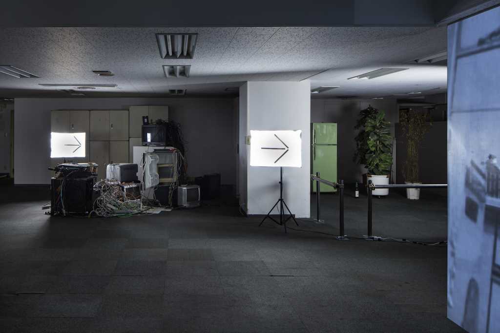
エントランス、受付、スポンサーブースなどがある明るく上品に設えられた1階から、展示室がある2階へと続く階段以降は、壁紙と床を剥がしただけのラフな状態。照明はサインを兼ねた撮影機材だけにし、ここでもコントラストを付けている。また展示室だけ綺麗になることで、そこに至る廊下や階段が、楽屋裏のように感じてしまうのを避けるため、2階の最初の展示スペースは、残置物を積み上げてパーティションをつくり、いきなり楽屋裏に展示がしてあるような状態をつくった。
「誰かに見せるためにデザインされたもの」と、「たまたまそこにあったもの」を等価に感じる体験を通してあらゆるものを面白がることができるきっかけになってくれれば嬉しい。(元木大輔/Daisuke Motogi Architecture)
【ART PHOTO TOKYO】
会場:東京都中央区日本橋茅場町1-6-12 茅場町共同ビルディング
会期:2016年11月
設計:Daisuke Motogi Architecture 元木大輔
施工:TANK
床面積:4502.05㎡
Photo:長谷川健太
We were commissioned to design an art fair venue using a vacant building in Kayaba-cho. Basically, the building was composed of a typical office building layout where the office compartments line up on both sides of the central corridor. You can find some good “retro” architectural details from the 70’s in some of the rooms, while there are other rooms littered with random bits and pieces, as if someone had to ran away under the cover of the night– it was more or less a “run-down” building.
The exhibition would take place on the 1st to 3rd floors, and 8th to 9th floors, where art galleries and photographers exhibit their works at the existing 30-plus office compartments on each floor. The client’s request for us was to plan the circulation route, design the passage and the common area.
It is interesting to note that there are two types of architectural or space design commissions; one is that the client asks you to design “contents” based on a certain story or a concept, such as in the case of shop design; the other is to design a “container” or platform” serving as a background, like art museums or houses. Although in my view, a container could also serve as a content at the same time.
ART PHOTO TOKYO like a “trade fair” of photographic works; we were requested to design an exhibition venue where not only artistic photographic works, but also all kinds of photographic works, from fashion to advertisement, are displayed side by side in multiple packages. In other words, the venue was expected to serve a platform as well as packaged contents.
Since ART PHOTO TOKYO was a four-day event, an easy construction method and materials were preferable. For this reason, we decided to tube pipes used for scaffolding; they are cheap and can be assembled easily. We decided to finish them with shiny gold plating, because the roughness of the material and the joint detail did not match the atmosphere of the place dealing with high-priced art works; and also I didn’t want to exaggerate temporariness and roughness associated with steel pipes. The counter was made of steel pipes finished with gold; here luxury and roughness were integrated without negating each other. Then, the plywood countertop was placed on top of the steel pipe legs, creating the contrasting effect of smooth and rough materials.
Entrance, reception counters, and sponsor booths were designed with lightness and elegance. In contrast, we maintained the rough texture of the stripped-off walls and floor of the stair and passage leading to the exhibition spaces on the second floor; the space is kept dark, illuminated only with ambient lighting for photo shooting, marked with the direction arrow sign.
We wanted to provide an ambiguous experience where we can hardly tell which parts are designed and which parts are garbage by reversing the “front” and the “back” from the beginning, because such space would accommodate diverse works in a more generous way. By doing so, we wanted to transform the existing corridor and stair into a space where all kinds of elements are juxtaposed, rather than simply treating them as circulation routes. By equally appreciating “what is designed” and “what happened to exist there”, we hope to provide an opportunity where people develop an eye to discover and appreciate diverse things without preconception.(Daisuke Motogi / Daisuke Motogi Architecture)
【ART PHOTO TOKYO】
Location:Kayabacho Kyodo Building, 2-13-13, Kayabacho, Nihonbashi , Chuo-ku, Tokyo
Period:November, 2016
Designer:Daisuke Motogi Architecture Daisuke Motogi
Construction:TANK
Floor area:4502.05 m²(including Exhibition Area)
Photo:Kenta Hasegawa

